Illustrating
Complex Relationships
In introductory courses such as chemistry, economics, political
science, and psychology, you will often see a complex set of relations
represented graphically. You will use graphs to make interpretations
about what is happening as variables in a relationship change.
While the examples below are taken directly from different
economics textbooks, they demonstrate the kinds of skills that
you will be required to use in many non-math introductory courses.
Example
|
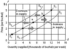
FIGURE 1: Changes in the supply
of corn
A change in one or more of the determinants of supply--resource
prices, productive techniques, the prices of other goods, taxes
and subsidies, price expectations, or the number of sellers in
the market--will cause a change in supply. An increase in supply
shifts the supply curve to the right as from S1 to S2. A decrease
in supply is shown graphically as a shift of the curve to the
left, as from S1 to S3. A change in the quantity supplied is
caused by a change in the price of the product as is shown by
a movement from one point to another--as from a to b--on a fixed
supply curve.
Adapted from: McConnell, C. R. & Brue, S. L. (1996) Macroeconomics:
Principles, problems and policies (p. 47). New York: McGraw-Hill. |
Figure 1 above shows changes in the supply of corn. In this
graph you can see how the curve shifts as the supply either decreases
or increases. In reading the legend of this graph you see that
a number of variables can affect this shift.
Example
|
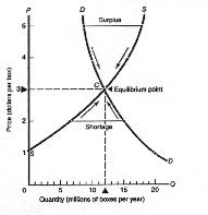
FIGURE 2 Market Equilibrium
Comes at the Intersection of Supply and Demand Curves
The market equilibrium price and quantity comes at the intersection
of supply and demand curves. At a price of $3 at point C, firms
willingly supply what consumers willingly demand. When price
is too low (say $2), quantity demanded exceeds quantity supplied,
shortages occur, and prices are driven up to equilibrium. What
occurs at a price of $4?
Adapted from: Samuelson, P. A. & Stone, G. W. (1995) Microeconomics
(p. 46). New York: McGraw-Hill. |
Figure 2 shows how one can determine when market equilibrium
occurs. This graph can be used to describe what happens when the
quantity and price of a particular product changes. In your courses,
you will need to be able to determine what are important points
on a graph and how to identity them. This involves using the graph
skills presented in this section.
The skills you will learn in this book are to:
- Describe how changing the y-intercept of a line affects the
graph of a line.
- Describe how changing the slope of a line affects the graph
of a line.
- Describe what has happened to an equation after a line on
a graph has shifted.
- Identify the intersection of two lines on a graph.
- Describe what happens to the x and y coordinate values of
intersecting lines after a shift in a line on the graph.
- Identify the Point of Tangency on a curve.
- Determine whether a line is a tangent line.
- Calculate the slope at a point on a curve.
- Determine whether the slope at a point on a curve is positive,
negative, zero, or infinity.
- Identify maximum and minimum points on a curve.
- Determine whether a curve does or does not have maximum and
minimum points.